PROJECT OVERVIEW
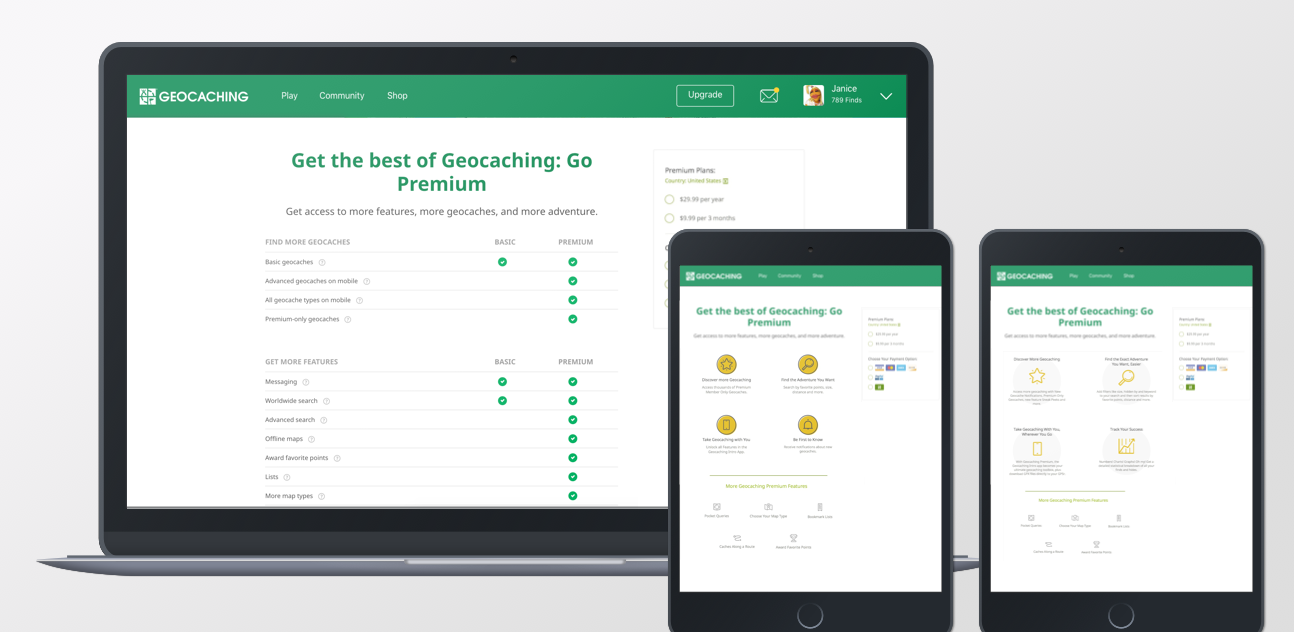
Before this project, the payments experience consisted of two pages: one very long page that explained what premium membership was, and a second page that collected payment information.
Analytics showed users dropping off before getting to the second page, so we set out to increase conversion with a new payments experience.
MVP
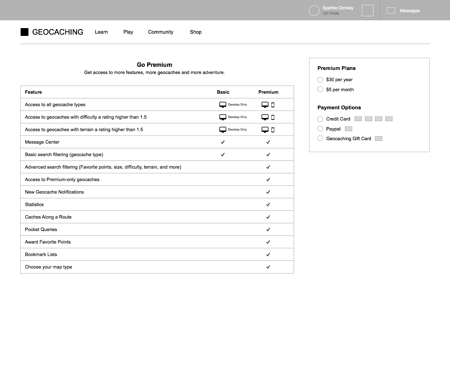
As a first step, we removed the first page, and redirected that traffic directly to the second page. This showed a small improvement in premium membership conversion, but that left us with an experience that didn’t teach users about the benefits of premium membership. Our hypothesis was that if we could redesign that page to teach users about premium membership and collect payment information, we’d reach our goal.
WIREFRAMING
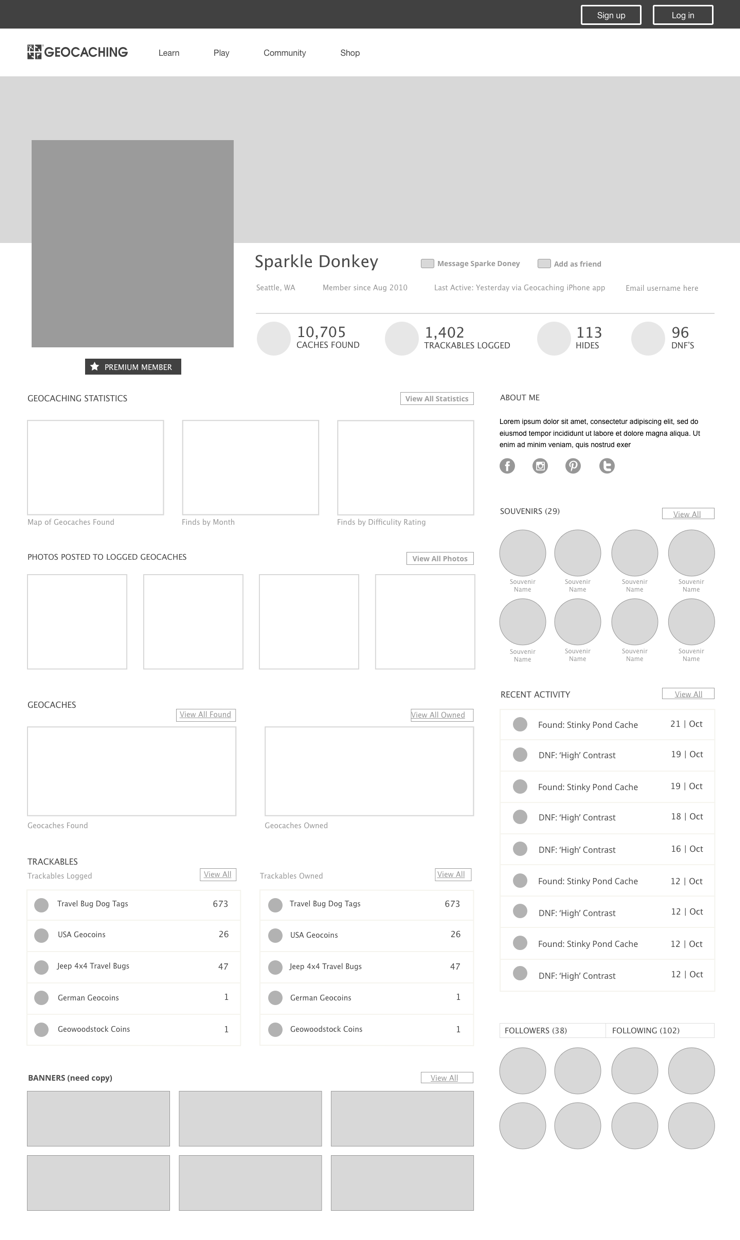
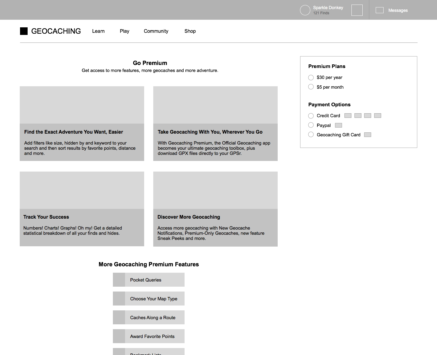
The marketing team collected survey data about what made users convert to premium membership. The product manager and I met with them to brainstorm the best ways to present the highest-ranked survey answers. I used the ideas from the brainstorm to design 3 wireframes.
We met with the development team to discuss scope, and decided to build all 3 designs to test which would work best.
A/B/C TESTING
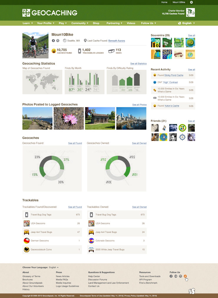
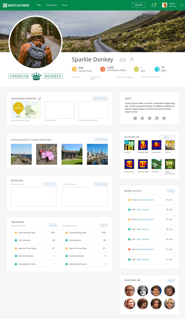
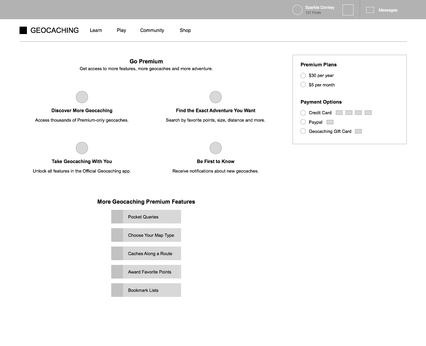
I collaborated with a visual designer who applied the digital brand, and we worked together with the development team to implement the designs. The designs were A/B/C tested, with the original payments page as a control. The chart design performed the best, converting an estimated 4% more users than the original payments page.
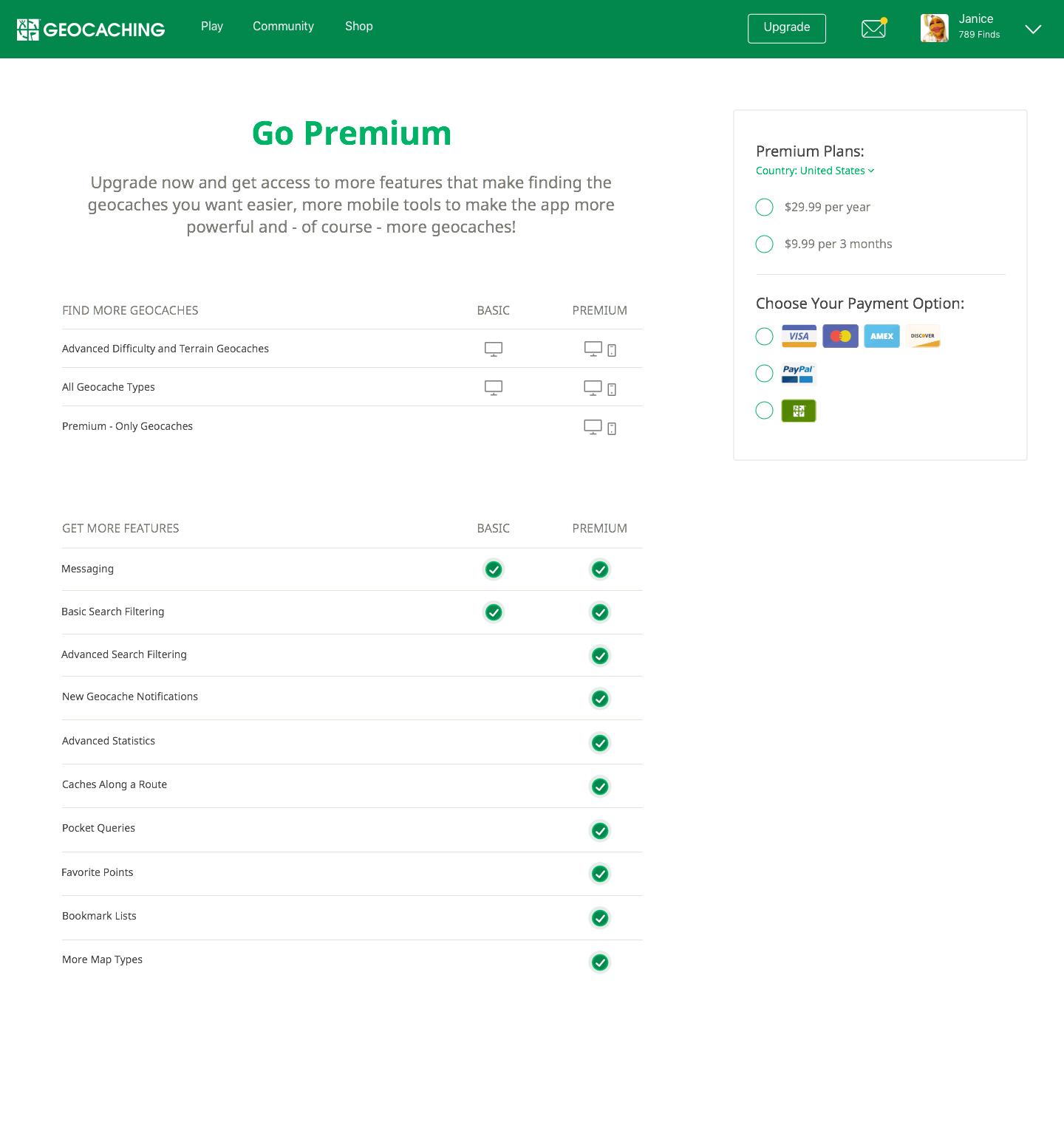
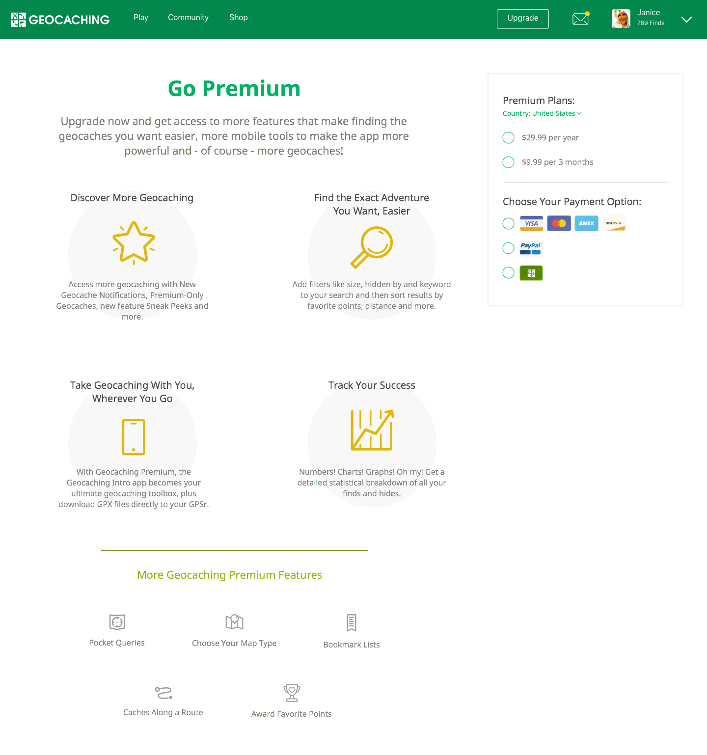
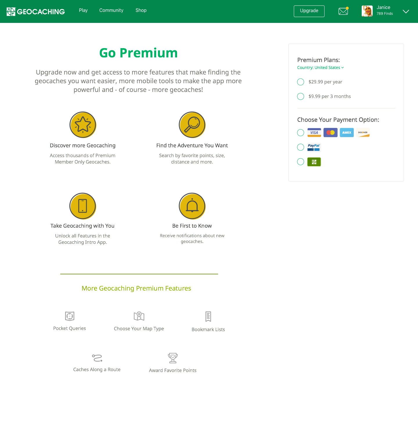
Premium membership page
Project Goal
To increase premium membership conversion on the website.Project outcome
Premium membership conversion on the website increased by ~4%.My Role
I was responsible for wireframing, prototyping, & testing. A marketing team did user research. I collaborated with another designer who was responsible for the visual design.The visual designer and I worked closely with a team of 4 engineers, 1 front end developer, and a product manager to implement the design.